BY STEVE CLARK, TREVOR CARTER AND BRUCE COWELL, EDITED BY PAM CARTER

https://nginx-develop-nfsa2.govcms7.amazee.io/sites/default/files/2024-04/Singoring%201000x745.jpg
BY STEVE CLARK, TREVOR CARTER AND BRUCE COWELL, EDITED BY PAM CARTER
This is Part Three in a three-part series. Read Part One and Part Two.
The NFSA’s collection includes early coloured films, many of which are tinted. As these films deteriorate with age, their colours are lost.
Steve Clark, Trevor Carter and Bruce Cowell from the NFSA’s Motion Picture Laboratory share their research about using traditional dyes and techniques to restore tinted films.
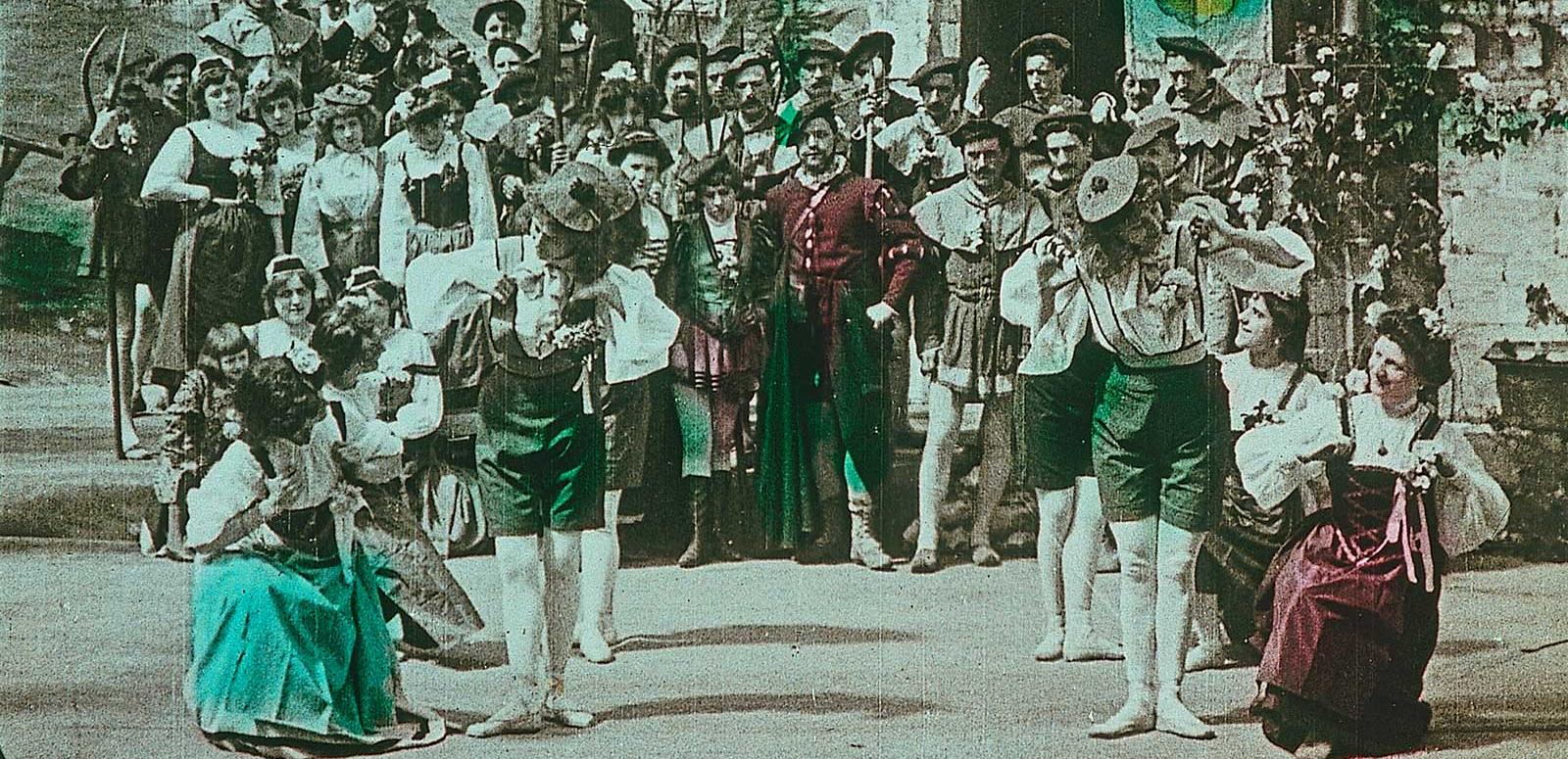
Following our successful machine tinting experiments, the lab was asked to try to tint copies of Corrick films being sent to the 2011 Pordenone silent film festival. Of the films being copied, one had blue titles and the rest had red titles. The project was not meant to provide an exact match of the tints in the original films but instead to give the feeling, the experience, of watching films tinted in the manner of the early 1900s. While we were able to approximate the tint used in the blue title, the films with red titles had been produced by a number of different companies, each using their own dyes. They had differing shades of red and some of these titles had faded to an extent that made it impossible to tell with certainty what the original colour had been. Because of this, it was impractical to try and re-create every shade of red. We decided to use original dyes and techniques to create an in-house tint, later known as NFSA Red 1, and use this colour for all of the red-tinted films being sent to the festival.
From our previous experiments it was clear that aniline dyes vary chemically. A Kodak film booklet from 1922 broke the dyes down into two kinds, acid and basic: ‘acid dyes being alkali salts of organic acids, while basic dyes are the chlorides, sulphates, etc, of organic bases’.20 We knew that some original dyes were highly corrosive, which could lead to Brittleness in the film. Even in the 1920s it was difficult to tell a dye’s type and properties (exactly) without conducting tests. Of the aniline dyes still commercially available we found two blues and three reds that appeared promising:
As with the Championship Boxing Contest project, our plan was to hand test the dyes and then modify our spare film processor to enable us to machine produce tinted tiles and intertitles. Hand testing was initially done in a glass beaker using a magnetic stirring system to keep the solution agitated. However, there were problems with uneven tinting, particularly around the sprocket holes, caused by irregular agitation. We overcame the issue by adopting the techniques used in the development of photographic films. Changing to a small stainless steel film developing tank, we gave the tank three inversions, at thirty second intervals, with no agitation in between. This produced an even result.
When we scaled up to machine processing, the time spent dyeing and washing the film (and the temperature of the dye solution) would be determined by limits of the processor. Because of this, we controlled the degree of uptake (absorption) of the dye into the film emulsion by varying the concentration of the dye. Each colour was tested in turn by dissolving a half a gram of powdered dye in one litre of water heated to 35°C. The solution was cooled to 21°C and a clear piece of processed release print film was immersed for eight minutes with agitation. It was then washed for ten minutes in running water. The test strips were compared and we chose the dyes to copy the Corrick titles based on dye stability and staff knowledge of the types of colours historically used in tinted films.
Only one of the films being copied had blue tinted titles and the processor has a large tank. To avoid wasting dye, this film was dyed by hand. Initial tests showed that between Sumiacryl Blue N3 GL and Basic Blue 5GL, the Basic Blue dye gave a better colour for our purposes. Our trial concentration (0.5 grams of Basic Blue 5GL per one litre of solution) and temperature (21°C) produced a colour without enough Saturation. We increased the concentration of the dye in steps, until we reached 10 grams per litre, which gave a good depth of colour. Further testing showed that we could increase the film’s uptake of the dye by raising the temperature of the dye to 25°C. However, we were still having issues with uneven tinting and the dye washed out too quickly (known as dye ‘bleed’).
Dye bleed diminishes the overall colour of the film and can produce droplets of water that have more or less dye in them. When dry, these irregular concentrations of dye set, showing up as spots or marks on the film when it is projected. We learnt from a 1922 Kodak manual that changing the pH of the dye solution could increase ‘the rate of dyeing’.21 We tried altering the pH and found that adding an alkali improved the film’s uptake of the dye. Adding sodium hydroxide or sodium carbonate created dye solutions that had extremely rapid uptakes. However, these solutions were difficult to control and the results were not repeatable (no two results were the same). After more testing, the pH was controlled by adding a weaker alkali — borax — added at a rate of 2.5 grams per litre of dye. Our final formula for the blue tint was:
10 gm/l Basic Blue 5GL + 2.5gm/l borax: hand dyed for 10 minutes at 25°C and washed for 10 to 12 minutes.
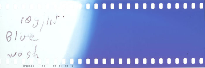
Above: Test strip for blue tint
Finding an effective red dye proved even more challenging. In a strange reversal of our first powdered aniline dye experiments for the Bashful Mr Brown project, no matter which of the three reds we tried the colour ended up looking orange. Panacryl Red GTLN washed out too easily, making the colour fade from red to orange. Basic Red GRL was very similar in colour and properties to Panacryl Red. Sumiacryl Red NGRL produced a true red but the dye washed out to such a degree that the remaining colour was almost non-existent. We decided to use Panacryl Red GTLN as the basis for our tests.

In the processor, Panacryl Red GTLN produced a rich red when exiting the dye tank but, after ten minutes of washing, the colour washed out to orange. We tried adding Sumiacryl Red NGRL, hoping that a mixture of the two dyes would compensate for the change of colour caused by the wash. The mix produced a good red colour but, once again, almost all of the Sumiacryl Red dye washed out and we were left with an orange tint. We ran tank tests to see if changing the pH of the dye could improve permanence but the dye continued to wash out regardless of any changes made to the pH. Due to this instability, we dropped Sumiacryl Red from our tests.
We tried a higher concentration of Panacryl Red GTLN (10 grams of Panacryl Red GTLN per litre of water). This gave a better red; however, when the dye washed out it was still too orange. We needed to reduce the amount of dye bleed. As with the blue tint, we decided to experiment with altering the pH of the dye solution. Adding borax (4 grams per litre) to the solution gave a good red that could tolerate 10 to 12 minutes of wash time and appeared to be stable when dry. However, when the film was projected it showed bands of streaking in numerous places. As the film had taken up the dye evenly during hand tinting, we assumed that this unevenness was being caused by the processor. To eliminate the problem we tried running the machine at a slower speed. This meant that the film would stay in the dye for a longer time, allowing the film’s emulsion to soak up more of the dye. Slowing the speed of the processor increased the intensity and evenness of the colour but resulted in a longer wash time (and more dye washed out). The end result was the same as running the processor at a higher speed. Eventually, the best result was obtained by running the film through the processor at 20 feet per minute, allowing a five minute dyeing time and a wash time of fifteen minutes. We also reduced the height of the wash racks to shorten the time the film spent in the wash. We had created a formula for our first in-house tint, NFSA Red 1:
10 gm/l Panacryl Red GTLN + 4gm/l borax: dyed for a minimum of five minutes at 20°C then washed for a maximum of 10–12 minutes.

Above: Test strip for red tint later known as NFSA Red 1
We were finally happy with the colour of both the red and blue tints. Our next challenge was to deal with the changes the dye had made to the [g[Density]] of the film. Densitometer readings showed that the dye had increased the minimum density of the films (from 0.3 to 1.05 for the films tinted red and up to 1.46 for the blue). When the films were projected, this made the titles look too dark and the lack of contrast made the words hard to read on the screen. Adding to this problem, when the titles had been copied from the tinted originals, hints of the original colour remained in what should have been clear text. Historically, the film would have been made with white text on a black background. When black-and-white copies are made from tinted originals, the background stays black but the tinted words copy over as grey (rather than white) text. This meant that, when we tinted our copies, we were adding colour to the already raised base density of the title.
To overcome this contrast gain, we had to remove the grey base from the text to create pure black-and-white titles. We made an underexposed new print and then over-processed it. This reduced the density of the film where it had little exposure (the grey text), without affecting the heavily exposed areas (the darker background). Film is not normally treated with a combination of underexposure and over-processing, as it reduces the fine detail in the on-screen image. However, titles and intertitles don’t have a great amount of highlight detail. We were able to make these adjustments without detracting from the film and it made the text much more legible.


Printing was done on a BHP 35mm motion picture contact printer onto Kodak 2302 print film, which was processed in Kodak D97 developer. Various exposure settings on the printer were tried (along with slowing down the processor speed by varying amounts to increase the development time) and the results were visually checked by projection. A reduced exposure in the printer of 12 lights, combined with processing at 50% of normal speed, gave a gamma of 3.11 (as compared with a norm of 2.66) and an upper and lower density on the Chinagirl of 0.17 and 1.32 before tinting (0.22 and 1.52 being normal). This change in density appeared to work for most of the titles. However, the density and contrast of motion picture image varies so much that each scene had to be approached on a case-by-case basis and printed and processed as required.
Having made adjustments in density and contrast during printing (based on the requirements for each film) we were able to produce black-and-white copies that would take up the tint without looking too dark. With this last piece of the puzzle in place we went back to our dye formulas and were finally able to tint blue and red titles for the Corrick films being sent to the Pordenone festival in 2011.
The results we achieved were so successful that we decided to try tinting both the titles and an action scene in the film the Jewel Robbers Mystified (Pathé Frères, 1910). The film ends with robbers opening a box of fireworks that has been substituted for their loot. The resulting explosion was tinted red. As the machine was already set up with NFSA Red 1 we tried tinting a copy of the scene and were impressed by the finished product. Based on our experience, we felt that this tinted copy had a more authentic appearance than a copy made on colour film could have achieved. Our research had taken an exciting step forward and the tinted Jewel Robbers Mystified was sent to Pordenone with the rest of the Corrick films.
The Motion Picture Laboratory’s tinted film research has been spread out over many years and trying to condense this information into one document has been challenging. In the title we described our work as: ‘Tinted Film Projects at the NFSA’. We used the plural ‘projects’ because our tinting research has been a series of learning experiences, rather than one continuous process. Each piece of work was sparked by a moment of professional curiosity (‘let’s try this and see what happens’) and ended up as a project: with a start, an end, and a final product (a tinted film or films). Collectively, these projects have provoked as many questions as they have provided answers and some of the lessons we have learned are detailed below.
Bashful Mr Brown started our research into powdered aniline dyes. Despite having issues with sourcing the dyes, we were impressed by the stability and vibrant colours that powdered dyes could achieve. Championship Boxing Contest demonstrated that, by modifying our equipment, it was possible to scale tinting up to a full production level. As the Corrick project demonstrated, at some point testing has to be scaled up from hand to machine processing. This is because, no matter how good the hand testing results are, the differences between the two processes are too great. In a hand tank, the film and dye sit motionless for the time between inversions and the solution can be heated to any temperature required. In a processing machine, the film is constantly moving through the dye in a linear manner, at a maximum speed of 28 feet per minute. The speed at which the processor is run affects the time the film spends in the dye and the length of wash time and this affects the outcome of the tinting. Each dye was affected differently and had to be judged on a case-by-case basis. Temperature can also be important for some dyes. Basic Blue 5GL required a higher temperature to encourage dye uptake but increasing the temperature of Panacryl Red GTLN did not significantly change the film’s absorption of the dye.
Adding acid or alkalis to the dye solutions produced some interesting results. During the testing phase of Basic Blue 5GL, we tried acidifying one batch of dye with a one per cent solution of acetic acid. This produced a light (even) blue that appeared to be permanent as no amount of washing weakened the colour. The colour wasn’t saturated enough to use for the Corrick titles we were copying but might prove useful for other tinted films. However, when we tried acidifying Panacryl Red GTLN the film had virtually no uptake of the dye. Intrigued by these results we went back to our texts and learnt that aniline dyes come in differing classes: acid and alkaline. These differing classes cannot be combined. Mixing acid and alkaline dyes results in an insoluble compound in which one or both of the dyes is precipitated out of the solution.22 The reaction of Panacryl Red GTLN to acetic acid implies that this dye has an alkaline base. Further colour mixing experiments could be rewarding as long as dyes of the same class are used together: acid dyes with acid dyes — alkaline dyes with alkaline.
Without knowing exactly which dye a film used, and at what concentration, modern tinted copies will always be more of an informed guess than an exact match. Film archivists have hypothesised that learning more about original dyes will enable us to ‘estimate the degree of fading that has occurred’ in the original, allowing modern and future preservation technologies to correct for fading.23 The NFSA’s tinted film experiments have not been about slavishly copying what remains of the faded past. Instead, we have tried to re-create the experience of tinted film. The heyday of silent films was the jazz age, an age of dazzling colours as well as subtle effects, as the dyes we have found clearly demonstrate. Through the work of the NFSA, the participants at Pordenone, and other film festivals, are able to see and appreciate the vibrant colours produced by dyeing film — tinted titles, projected on the big screen, that are true to spirit of the original films.
Each of the NFSA’s tinted film projects has been a separate piece of work, yet each project was influenced by the research that preceded it and informed by the work of others in the archival film field. By detailing our experiences we hope we have added our bit of knowledge to the preservation and restoration of tinted film. As our tinted film projects used black-and-white film (which is more stable than colour stock), we expect that these tinted copies will have a greater archival life — only time will tell. The fact remains that coloured films are some of the most precious and at-risk material in archival collections and more needs to be done to preserve and restore these films.
This is Part Three in a three-part series. Read Part One and Part Two.
This document was written by Trevor Carter, Steve Clark and Bruce Cowell and is based, in part, on previous research done by staff at the NFSA.
As far as practicable we have listed the people and texts that have informed this work in the endnotes. The images in this work were sourced from the NFSA collection or provided by the authors and other members of staff at the NFSA.
20Kodak, 1922, Tinting and Toning of Eastman Positive Motion Picture Film (3rd edition), Eastman Kodak Co. [Note: This is a reproduction from a photocopy of the original text and page numbers have not been included]; Kodak, 1927, Tinting and Toning of Eastman Positive Motion Picture Film, Eastman Kodak Co., published online at http://www.brianpritchard.com/Tinting.htm
21Kodak, 1922, ‘Brittleness of Film’
22Kodak, 1922, ‘Choice of Dyes’
23Read and Meyer, 2000, p290
The title for this work was inspired by the Dylan Thomas poem ‘Do not go gentle into that good night’, Dylan Thomas, Collected Poems 1934–1952.
The story behind the photochemical restoration of the Corrick Collection.

The Corrick Collection of films has now been digitised and is once again able to be shared with audiences.

Stewart Corrick writes about his grandfather Leonard's famous family of entertainers and the 40-year mission to preserve and digitise the Corrick Collection.
The National Film and Sound Archive of Australia acknowledges Australia’s Aboriginal and Torres Strait Islander peoples as the Traditional Custodians of the land on which we work and live and gives respect to their Elders both past and present.